
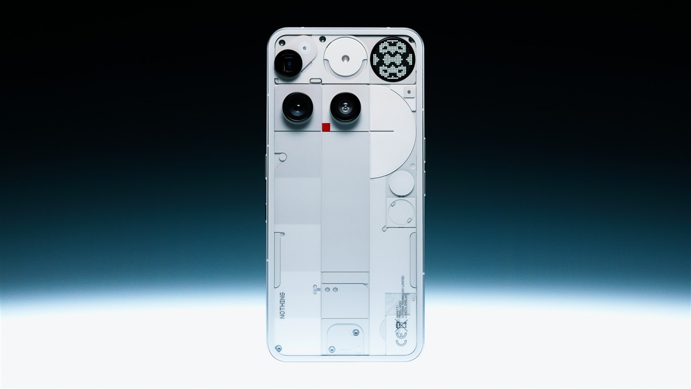
In a sea of polished rectangles and black glass, Nothing Tech has carved a striking identity by showing us what lies beneath. Its transparent hardware is not a gimmick, but a deliberate shift in design philosophy. Where many brands polish away the evidence of complexity, Nothing brings it to the forefront. Every visible screw, wire, and component speaks to a blend of visual honesty and bold creativity.
Instead of hiding the technical skeleton, the company chooses to highlight it. Their smartphones and earbuds invite curiosity, not just through performance, but through the allure of the unknown made visible. It’s tech laid bare, but done artfully. And that’s where Nothing sets itself apart.
More than skin deep
Transparency in design is deceptively intricate. Creating tech that looks clean while exposing its internal structure requires exceptional coordination between aesthetics and hardware engineering. Each element visible on a Nothing device has been reimagined to contribute visually. The frame, for example, isn’t just functional, it’s sculpted to reflect light in a certain way. LED accents are carefully positioned to provide rhythm, not just notification.
Every line, texture, and material must serve two purposes: to work and to please the eye. This dual focus makes their devices feel crafted rather than manufactured. And while the design may look effortless, it is anything but. Each detail is curated to achieve a balance that others often overlook in favour of minimalism or pure function.
Speaking to a visual-first generation
Younger consumers are no longer just looking for devices that perform, they want tech that reflects who they are. Identity has moved into the digital realm, and what we carry becomes part of that expression. For Gen Z and millennials who prioritise individuality and design fluency, Nothing’s devices strike a powerful chord.
The choice to go transparent feels rebellious in a category dominated by glossy conformity. It offers an aesthetic narrative, a story in clear casing, that speaks louder than brand slogans. These users appreciate the sense of openness and authenticity the design communicates. It feels different, it looks different, and it makes people look twice.
Setting itself apart from the usual suspects
Most major tech brands stick to a safe palette, dark hues, uniform shells, and sleek but indistinct silhouettes. The industry standard seems to favour invisibility; devices are meant to blend in, not stand out. That’s where Nothing moves in another direction.
Where competitors polish over internal components to present a seamless surface, Nothing leans into the contrast of form and function. Instead of hiding its circuitry, it makes that architecture part of the appeal. This visual honesty disrupts expectations and forces a new conversation about how tech should look.
It’s not nostalgia, though it might remind some of see-through gadgets from decades past. It’s a refined, grown-up version, less toy, more art piece. Where others rely on branding to create recognition, Nothing builds memorability into the product’s silhouette and detail.
Beyond trend, a clear point of view
Transparency for Nothing is not a seasonal flourish, it’s a foundation. It reflects a company confident enough to be different, and technically capable enough to pull it off. There’s no need for marketing tricks when the product itself turns heads.
In a marketplace overflowing with near-identical devices, the value of distinctiveness can’t be overstated. The brand has taken a risk, and it resonates. It shows that simplicity doesn’t have to mean sameness and that clarity, both in design and philosophy, holds a kind of quiet power.
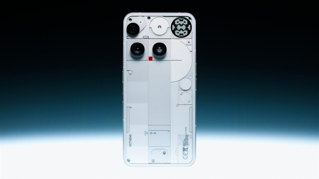
For those tired of indistinguishable rectangles and soulless tech, the answer is suddenly quite clear. To discover more about this unique approach to design and explore the latest releases, visit the official Nothing Tech website.